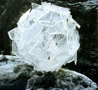
I've loved Andy Goldsworthy's work for many years. The detail and precision is amazing, below are just three examples of hundreds of natural sculptures he creates. It really shows when someone takes pride in their work. Influenced by the ice sculptures, I've been experimenting with creating ice work in Photoshop. Check out my recent experiments on my work blog here.
Monday 26 December 2011
Sunday 18 December 2011
Google - Let It Snow
Once again, Google are getting involved in festivities. This time, by typing "let it snow" into the search box, the window starts to snow and mist up, until the page can barely be seen apart from a box with the word "defrost".
Saturday 17 December 2011
Jack Daniels Packaging
Every so often I get items through the post from Jack Daniels. Most recently was a set of coasters. I like the typography they use on the packaging. The simple black, white and orange are very effective (the orange being a similar colour to the whiskey itself). By sending out small items at no cost to the recipient, they are strengthening the brand by giving a feeling that Jack Daniels cares about its customers and likes to reward them for their loyalty.
Monday 12 December 2011
Grafik Magazine Discontinued. The Future of Magazines?
I've recently heard about the magazine Grafik being discontinued. Just over a ago I had a subscription to the mag and did enjoy reading through the articles and reviews. It brings into mind the question of how important magazines are these days, especially when the internet is so readily available with it's mountain of up to date information. I like to have my magazines as reference material, but they take up so much room and sometimes finding an article or designer can take ages as I have to search through each journal. Using bookmarks on internet browsers are much easier, and you can search for words or phrases in text. Computers can break though, and what if all those bookmarks are lost? It would be as though someone has stolen your library, and I'm not sure if there's many of those crimes in the UK.
There's just something nice about having an item to own and keep. The internet is great, and I'm not giving up on magazines and books.
There's just something nice about having an item to own and keep. The internet is great, and I'm not giving up on magazines and books.
Thursday 8 December 2011
Stumbleupon Redesign
I absolutely love stumbleupon. I've spent many hours getting lost in the internet browsing through websites, blogs, portfolios, videos and games. So when I saw the redesign of my procrastination tool by Huge, I was happy to see it looking more sophisticated. The logo feels more considered and designed, that's not saying the previous logo wasn't good, but it felt slightly dated. With stumbleupon becoming more popular by the day, it needs to be at the forefront to fend off any competition that may arise.Saying all that though, I feel that the logo and text are slightly mismatched. The icon is great, and so is the type, but when put together they typeface doesn't seem as smooth as the logo.
Old Logo
New Logo
Old Logo
New Logo
Labels:
Branding,
Design,
Graphic Design,
Logo,
Rebranding,
Redesign
Tuesday 29 November 2011
Simplifying Logos
Simplifying logos can make them immediately more impressive. I often found when struggling with logo design, to strip it back to the bare minimum and see if the extra bits were really needed. As a brand and the logo becomes more well known, removing the name or any text can be beneficial in giving the look of the company a bit of a facelift.
More recently the Starbucks logo was stripped back, but so have these other examples (image taken from logo design love)
More recently the Starbucks logo was stripped back, but so have these other examples (image taken from logo design love)
Labels:
Branding,
Design,
Graphic Design,
Logo,
Rebranding,
Redesign
Friday 25 November 2011
AT&T Hand Art Adverts
Just amazing! Adverts that give make you double take, and then look a while longer are really well worked and successful.
Tuesday 22 November 2011
Kerning Game
This game is a really good test to see how good you are at kerning. I got 96/100..was a little wonky on one but got 100% on most! Give it a try!
Kerning game crafted by Mark MacKay for Method of Action
Wednesday 16 November 2011
Barcode Design
As a designer it's important to think about the whole experience for whoever's viewing, buying, selling or doing whatever with a designed item. Barcodes are generally a necessity for packaging, however they don't have to look so square and boring. They can be made so much more interesting by just giving them a little thought. Even though the style of barcode won't sell the product, as a consumer, I would feel more confident in buying it if I could see that it had time spent on it to make it appeal to me, and the company felt it was worth going that little bit further in the design.
Tuesday 8 November 2011
Designboom
Came across this website today. Quite a few 3D related articles but a good read all the same. It's a good source of current and past design competitions (with photos of the winning entries).
All found at designboom.
All found at designboom.
Wednesday 2 November 2011
La Presse new logo
La Presse is a french newspaper based in Montreal and have recently updated their logo.
The new square logo has replaced the previous rounder version, and I've noticed a trend recently in angular shapes in logo design. Squares work really well as they give a frame for other items to be placed around them, both in print and digitally.
With newspapers generally declining as people read the news online, it's important to have a non-cluttered web page where people can find the article they are interested in quickly and without hassle. Some of the websites I find most annoying are the ones which have too much useless tat taking up valuable space! A good grid is essential in all cases.
Image taken from newseum.org
Labels:
Branding,
Design,
Graphic Design,
Logo,
Rebranding,
Redesign
Tuesday 1 November 2011
Branding Article
I've been reading articles refreshing my graphic design brain and came across this interesting one from Fatima Mekkaoui at sixrevisions.com. It's good to read something that is well written and doesn't bulk up the article with useless babble.
Tuesday 25 October 2011
A few photos from my American travels
A huge elephant at San Diego zoo, the classiest watering hole in Tijuana, Mexico, the amazing ceiling at the Griffith Observatory, Los Angeles, weird backlit skull sculpture in a restaurant in Las Vegas, a never-ending corridor in The Venetian, Las Vegas and a beautiful sunrise whilst flying over the Atlantic.
Friday 21 October 2011
Morrisons Own-Brand Range
Morrisons recently redesigned their own-brand range of products. The company chosen to undertake the project was Coley Porter Bell, who also designed the Tesco Organic range.
With more people unable to afford dining out, it is important to make the dine-in ready meal/cook at home ranges to seem like something special and a treat. The bistro range does that, with black packaging and warm foody coloured accents.
According to Design Week, the Morrisons Value range will be next to have a facelift. I'm expecting great things!
Friday 1 April 2011
Kohler Chocolate Packaging
Kohler chocolate packaging is very elegant and well designed. There is a classic feel, however still feels somewhat contemporary. The buyer is getting chocolate that is desirable, not only through taste but aesthetically also.
Sunday 27 March 2011
30 Corporate Design Typefaces
A magazine article with 30 typefaces suitable for corporate design. It's good to have a bit of background knowledge on the fonts and how, when and by whom they were designed. I'm sure this article will help me when I'm struggling to find a suitable typeface.
30 Corporate Design Typefaces
30 Corporate Design Typefaces
Sunday 6 March 2011
Cut Paper Art
Peter Callesen creates beautiful paper art. It's impressive what can be created using just paper and glue, and also the scale of some of the pieces.
Information about other works, exhibitions and more images can be seen here.
Information about other works, exhibitions and more images can be seen here.
Saturday 5 March 2011
Pencil Lead Art
Absolutely amazing pencil lead art created by Dalton Ghetti. It's so precise and intricate.
More images can be seen here
Wednesday 12 January 2011
Starbucks Logo
I'm liking the new Starbucks logo at the moment. It's much simpler and is free of the circles boundary from the previous logos. The text has also been removed, and with it being such an iconic logo, it's still as effective and obvious of the company as ever before.
It's definitely been brought up to date, looking more contemporary but still keeping the main element that has been the logo seen since 1971.
Beach Calligraphy
I came across these amazing images yesterday and was really impressed. The artist is Andrew van der Merwe, in a style he calls beach calligraphy.The carving into the sand is so precise, with wonderful shadows cast into the lines, and the location looks so serene.
Find more photos and information here
Subscribe to:
Posts (Atom)


