Wednesday, 17 October 2012

Ribena Light Packaging Redesign - Aesop

New Ribena Light packaging by Aesop in London. Much simpler, cleaner and feels more refreshed. Removing some of the imagery makes it fit with the idea that there's less sugar. A sort of scaled back version of the 'full-fat' original version. Ribena have recently made a big effort to show that they use blackcurrants grown in Britain so to have a redesigned packaging will refresh the image and keep people talking about the brand.


I still have the idea that if a product has to have a 'light' or 'diet' version, then the original must not be too healthy for you!

Thursday, 4 October 2012

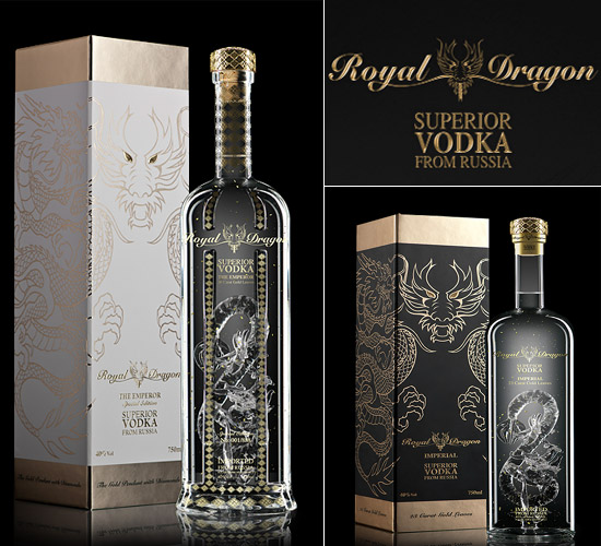
National Vodka Day

Happy National Vodka Day! To celebrate, I've been having a look at some beautifully designed vodka bottles.


Tuesday, 2 October 2012

eBay Logo Redesign

eBay have announced they have redesigned their logo after seventeen years. I haven't been a massive fan of the original logo. It's seemed rather childish and hastily put together, but over time it's grown on me and the colours and style is now totally associated with eBay.


The new logo has lost the playfulness. It's like the brand is trying to grow up, but whilst doing so it is taking away the community feeling that the previous logo had. I'm not a massive fan of the lack of kerning. The letters should either be how they were previously, or not connecting at all. I do prefer the colours, particularly the blue as it seems to flow more, and my eye doesn't get stuck on the letter b.

It's always going to be a tough job to redesign such a memorable logo, and everyone has their own opinions. This design could have been better, but could have been a lot worse.

Saturday, 15 September 2012

Diet Coke and Jean Paul Gaultier

Diet Coke is still viewed as a ladies drink. Coke Zero is more masculine and has been marketed as such. So a connection between fashion and Diet Coke seems like an obvious thing. At the beginning of 2012 Jean Paul Gaulier was selected as the creative director for Diet Coke. Since then various things have been created to promote the two brands. He isn't the first fashion designer to collaborate with Coke. Karl Lagerfeld, Matthew Williamson and Roberto Cavalli have also worked with the brand.


The obvious change is the packaging. It's an easy and very visible way to get consumers to see the connection between the two brands. There have also been adverts which include the small puppets and Gaultier himself. Posters which feature models using photos of Gaultier have also been created.


I think it's great for designers to collaborate and work on different projects. It must be refreshing to be given a different task, and to be able to make your mark on something that you wouldn't usually have the opportunity to.

Thursday, 13 September 2012

Darrin Crescenzi - A Game of Thrones icons

Like many others, I've become obsessed with the series A Game of Thrones. I'm currently working my way through the novels which is taking quite a while as I seem to be really busy at the moment.

Darrin Crescenzi also loved the series, and created a series of icons for each of the families. It was a personal project, and probably quite a nice change from the Nike brand design he usually works on.
It's brilliantly designed, colourful, and a good contemporary take on what could have ended up being too traditional.

A poster was available but has sold out.


Thursday, 6 September 2012

Tips for getting a design job

There's so many articles available on the web with help tips for graduates and people looking for jobs. With so many people applying for each job, it's important to stand out and use blogs, websites social networking etc to your advantage.

I recently came across this article on graphicdesignblog.co.uk which outlines the steps that are needed to successfully get that first job in the design industry. It's worthwhile reading the tips from articles such as the one linked, because as a student or graduate, there's still a lot to learn about the industry,

Sunday, 2 September 2012

Big Fish Design Studio

I've been looking around the web at design studios for inspiration, and to see how they like to present themselves through their website. One studio that really caught my eye was big fish. They started in 1994, and since then have created "60 brand identities, over 1,000 items of literature, and gazillions of packs, written 27 brand strategies, 32 marketing strategies, a hell
of a lot of words, designed & built over 100 websites, art directed over 1,000 photoshoots, shot many 1,000's ofhigh definition images in our photographic studio, written, designed & produced 140 press ads and have directed & produced our first cinema commercial."

With a very impressive client list, awards, and an obvious love of what they do, big fish are certainly a bright team of creative minds.

Below is a series of work created by big fish. Fresh, clean and beautiful.