A great website where I can, and have, lost many hours just browsing. Lots of great inspiration from all aspects of design.
www.designspiration.net/

Showing posts with label Branding. Show all posts
Showing posts with label Branding. Show all posts
Sunday, 25 January 2015
Thursday, 29 November 2012
Vapour - Nike ACG 20th Anniversary Brochure
I found this work a year or so ago, and recently came across it again, and still really like it. It is created by Vapour, a design agency in Leeds. The retro feel, colours, shapes and patterns work well with the brand Nike have established for themselves. The photographs appeal to the active type of person that they are wanting to connect with, and are very far removed from the typical outdoor clothing and accessories that can be plain in colour and not very attractive.


I know it's taken me a while to post this, as the work was produced in 2009, but I like it and think it deserves to be shared.


I know it's taken me a while to post this, as the work was produced in 2009, but I like it and think it deserves to be shared.
Wednesday, 17 October 2012
Ribena Light Packaging Redesign - Aesop
New Ribena Light packaging by Aesop in London. Much simpler, cleaner and feels more refreshed. Removing some of the imagery makes it fit with the idea that there's less sugar. A sort of scaled back version of the 'full-fat' original version. Ribena have recently made a big effort to show that they use blackcurrants grown in Britain so to have a redesigned packaging will refresh the image and keep people talking about the brand.

I still have the idea that if a product has to have a 'light' or 'diet' version, then the original must not be too healthy for you!

I still have the idea that if a product has to have a 'light' or 'diet' version, then the original must not be too healthy for you!
Tuesday, 2 October 2012
eBay Logo Redesign
eBay have announced they have redesigned their logo after seventeen years. I haven't been a massive fan of the original logo. It's seemed rather childish and hastily put together, but over time it's grown on me and the colours and style is now totally associated with eBay.


The new logo has lost the playfulness. It's like the brand is trying to grow up, but whilst doing so it is taking away the community feeling that the previous logo had. I'm not a massive fan of the lack of kerning. The letters should either be how they were previously, or not connecting at all. I do prefer the colours, particularly the blue as it seems to flow more, and my eye doesn't get stuck on the letter b.
It's always going to be a tough job to redesign such a memorable logo, and everyone has their own opinions. This design could have been better, but could have been a lot worse.


The new logo has lost the playfulness. It's like the brand is trying to grow up, but whilst doing so it is taking away the community feeling that the previous logo had. I'm not a massive fan of the lack of kerning. The letters should either be how they were previously, or not connecting at all. I do prefer the colours, particularly the blue as it seems to flow more, and my eye doesn't get stuck on the letter b.
It's always going to be a tough job to redesign such a memorable logo, and everyone has their own opinions. This design could have been better, but could have been a lot worse.
Saturday, 15 September 2012
Diet Coke and Jean Paul Gaultier
Diet Coke is still viewed as a ladies drink. Coke Zero is more masculine and has been marketed as such. So a connection between fashion and Diet Coke seems like an obvious thing. At the beginning of 2012 Jean Paul Gaulier was selected as the creative director for Diet Coke. Since then various things have been created to promote the two brands. He isn't the first fashion designer to collaborate with Coke. Karl Lagerfeld, Matthew Williamson and Roberto Cavalli have also worked with the brand.


The obvious change is the packaging. It's an easy and very visible way to get consumers to see the connection between the two brands. There have also been adverts which include the small puppets and Gaultier himself. Posters which feature models using photos of Gaultier have also been created.


I think it's great for designers to collaborate and work on different projects. It must be refreshing to be given a different task, and to be able to make your mark on something that you wouldn't usually have the opportunity to.


The obvious change is the packaging. It's an easy and very visible way to get consumers to see the connection between the two brands. There have also been adverts which include the small puppets and Gaultier himself. Posters which feature models using photos of Gaultier have also been created.


I think it's great for designers to collaborate and work on different projects. It must be refreshing to be given a different task, and to be able to make your mark on something that you wouldn't usually have the opportunity to.
Thursday, 13 September 2012
Darrin Crescenzi - A Game of Thrones icons
Like many others, I've become obsessed with the series A Game of Thrones. I'm currently working my way through the novels which is taking quite a while as I seem to be really busy at the moment.
Darrin Crescenzi also loved the series, and created a series of icons for each of the families. It was a personal project, and probably quite a nice change from the Nike brand design he usually works on.
It's brilliantly designed, colourful, and a good contemporary take on what could have ended up being too traditional.
A poster was available but has sold out.


Darrin Crescenzi also loved the series, and created a series of icons for each of the families. It was a personal project, and probably quite a nice change from the Nike brand design he usually works on.
It's brilliantly designed, colourful, and a good contemporary take on what could have ended up being too traditional.
A poster was available but has sold out.


Sunday, 2 September 2012
Big Fish Design Studio
I've been looking around the web at design studios for inspiration, and to see how they like to present themselves through their website. One studio that really caught my eye was big fish. They started in 1994, and since then have created "60 brand identities,
over 1,000 items of literature, and gazillions of packs, written 27 brand strategies, 32 marketing strategies, a hell
of a lot of words, designed & built over 100 websites, art directed over 1,000 photoshoots, shot many 1,000's ofhigh definition images in our photographic studio, written, designed & produced 140 press ads and have directed & produced our first cinema commercial."
With a very impressive client list, awards, and an obvious love of what they do, big fish are certainly a bright team of creative minds.
Below is a series of work created by big fish. Fresh, clean and beautiful.


of a lot of words, designed & built over 100 websites, art directed over 1,000 photoshoots, shot many 1,000's ofhigh definition images in our photographic studio, written, designed & produced 140 press ads and have directed & produced our first cinema commercial."
With a very impressive client list, awards, and an obvious love of what they do, big fish are certainly a bright team of creative minds.
Below is a series of work created by big fish. Fresh, clean and beautiful.


Friday, 24 August 2012
Microsoft New Logo - Rebrand
Microsoft are unveiling a new logo, 25 years after the last update. With the company about to release Windows 8, and new versions of almost all of their products, it's the perfect time to freshen up the look. There are so many platforms for the windows products, including desktop computers, laptops, notebooks, tablets, phones and games consoles. It's important to make sure that their brand works visibly and efficiently without any weak points.


Regarding the logo, I feel that it could have been a bit more exciting. This was an opportunity to really go for something new. The 4 squares are quite plain, however the kerning of the letters is perfect and pleasing to look at. I'm not saying that the logo is totally bad, and until I have seen how they are implementing it across the whole brand, it's wrong to criticise.

Microsoft Old Logo

Microsoft New Logo
Regarding the logo, I feel that it could have been a bit more exciting. This was an opportunity to really go for something new. The 4 squares are quite plain, however the kerning of the letters is perfect and pleasing to look at. I'm not saying that the logo is totally bad, and until I have seen how they are implementing it across the whole brand, it's wrong to criticise.
Wednesday, 15 August 2012
Australia Cigarette Packaging Law
An Australian court has backed a new law which stops all branding on cigarette packets. Instead the packaging will now be olive green and will feature graphic health warnings and images on smoking related illnesses.
The tobacco companies are huge, and I'm sure they will have tried to fight this new law, but I think that they probably presumed that the law would not be successful. Smoking laws have been getting stricter, with people not being able to smoke in public places in the UK, even at bus stops. I personally agree fully, and think that people who don't smoke should not be subjected to other people's harmful
Regarding the branding of cigarettes, it has been getting more restricted over the last 20 years. Advertising on tv ceased in the mid 1990s, with shops following in 1999. As with alcohol, the cigarettes can't promote that they are good for your health, make you look cool, professional or calm you down. It's all up to the recognisable logos, the colours, shapes and styles. Tobacco companies have argued that it will be easier for fake cigarettes to be sold, as the packaging will be easy to copy. I think this is probably true, but I think that preventing the companies from using bright, attractive packaging will be a step forward in stopping people smoking.
Britain is considering a law on plain packaging also. Australia have paved the way for other countries to follow in their footsteps, to try protect the health of their nation.
I hope that this law stays as it will hopefully save lots of lives, free up hospitals and clinics from people who have smoking related illnesses, and promote healthier living.
The tobacco companies are huge, and I'm sure they will have tried to fight this new law, but I think that they probably presumed that the law would not be successful. Smoking laws have been getting stricter, with people not being able to smoke in public places in the UK, even at bus stops. I personally agree fully, and think that people who don't smoke should not be subjected to other people's harmful
Regarding the branding of cigarettes, it has been getting more restricted over the last 20 years. Advertising on tv ceased in the mid 1990s, with shops following in 1999. As with alcohol, the cigarettes can't promote that they are good for your health, make you look cool, professional or calm you down. It's all up to the recognisable logos, the colours, shapes and styles. Tobacco companies have argued that it will be easier for fake cigarettes to be sold, as the packaging will be easy to copy. I think this is probably true, but I think that preventing the companies from using bright, attractive packaging will be a step forward in stopping people smoking.
Britain is considering a law on plain packaging also. Australia have paved the way for other countries to follow in their footsteps, to try protect the health of their nation.
I hope that this law stays as it will hopefully save lots of lives, free up hospitals and clinics from people who have smoking related illnesses, and promote healthier living.
Monday, 13 August 2012
Coke Zero and James Bond Skyfall
After the success of Quantum of Solace, Coke Zero are teaming up with James Bond once again for the 2012 film, Skyfall. I thought their 'Unlock the 007 in you' slogan was good, but the Coke Zero Zero 7 idea was brilliant. I love a play on words - it seems simple but it takes a clever brain to implement the idea successfully.
In my opinion, Coke Zero has always been aimed at men. Diet versions of food and drink are certainly marketed towards women, and Coke Zero have made it ok for men to have a lower calorie drink without losing any of their macho image. James Bond is most definitely a macho man, and to associate the two brands works perfectly.
Below are some images of the Quantum of Solace Coke Zero promotion.
I'm looking forward to seeing the new promotional material, and if it beats the past offerings.


In my opinion, Coke Zero has always been aimed at men. Diet versions of food and drink are certainly marketed towards women, and Coke Zero have made it ok for men to have a lower calorie drink without losing any of their macho image. James Bond is most definitely a macho man, and to associate the two brands works perfectly.
Below are some images of the Quantum of Solace Coke Zero promotion.
I'm looking forward to seeing the new promotional material, and if it beats the past offerings.


Sunday, 12 August 2012
Toscatti Packaging
At first when I saw the images of these containers I thought it was paint, but after reading further I found it was clever packaging for containers by Toscatti. The creatives behind the design are Anagrama in Mexico. The colours are fresh and attractive, the packaging design is clean and tidy, and the sizes and styles of each container is easily seen. The typeface was designed specifically for Toscatti, and is rounded, friendly and importantly, legible.
I like this design, even if it still does look like paint swatches!

I like this design, even if it still does look like paint swatches!

Tuesday, 7 August 2012
Yell Rebrand as Hibu
So it seems Yell are rebranding themselves, getting rid of the name and image, and becoming Hibu
Yell needed to do something to refresh themselves after reporting an annual loss of £1.4 million, so they called on Landor Associates to help them out. I'm not really a fan of the made up, nonsense style names, so right now I'm not so impressed, but it may be one of those names that grows on me the more I hear it. The Yellow Pages was always seen by the phone as I was growing up, and some of the adverts (the boy getting the yellow pages to stand on so he would be tall enough to give a girl a kiss) stay in my memory. With the internet and all the information and adverts readily available, and for free, they have to really set themselves as the go-to place for when you need a plumber, a tree surgeon or even a dog walker.

Above is the new logo. Yell said in a statement, ‘Communities are built on the connections people make and people are connected at the heart of the hibu logo. The identity utilises typography with soft shouldered edges like the human body and coloured dots represent the people behind the identity, diversity, connections and conversation. By using bold lower-case typography with soft edges we project a human and approachable company.’
I quite like the logo, although it does remind me of Gu, the luxury pudding people. I think it's the dots above the 'u' and because both logos are quite rounded.
I think ditching the recognised name and logo could be dangerous, but if done well, they could go back to their directory heyday. Only time will tell.
Yell needed to do something to refresh themselves after reporting an annual loss of £1.4 million, so they called on Landor Associates to help them out. I'm not really a fan of the made up, nonsense style names, so right now I'm not so impressed, but it may be one of those names that grows on me the more I hear it. The Yellow Pages was always seen by the phone as I was growing up, and some of the adverts (the boy getting the yellow pages to stand on so he would be tall enough to give a girl a kiss) stay in my memory. With the internet and all the information and adverts readily available, and for free, they have to really set themselves as the go-to place for when you need a plumber, a tree surgeon or even a dog walker.

Above is the new logo. Yell said in a statement, ‘Communities are built on the connections people make and people are connected at the heart of the hibu logo. The identity utilises typography with soft shouldered edges like the human body and coloured dots represent the people behind the identity, diversity, connections and conversation. By using bold lower-case typography with soft edges we project a human and approachable company.’
I quite like the logo, although it does remind me of Gu, the luxury pudding people. I think it's the dots above the 'u' and because both logos are quite rounded.
I think ditching the recognised name and logo could be dangerous, but if done well, they could go back to their directory heyday. Only time will tell.
Thursday, 26 July 2012
Metal Business Cards
I've been very busy recently, but been redesigning a few things as I'm looking for jobs. i came across these business cards which as much more interesting and will give a prospective employer a reason to remember you. Cards often get discarded if they aren't required, interesting or designed well, so this will make sure that your business card doesn't get thrown in the bin. Also the price isn't the cheapest, so it will show your dedication to the profession you are seeking to get into. Unfortunately I don't have the funds at the moment so will have to design something exceptional using standard formats.
These cards, along with standard and plastic can be found at Plasma Design

These cards, along with standard and plastic can be found at Plasma Design


Sunday, 4 March 2012
Coley Porter Bell - M Savers
Another great redesign by Coley Porter Bell. Again, like one of my previous posts, it is regarding Morrisons own brand food range. The own brand range have progressed to have different varieties, from the cheapest-of-the-cheap, to the cheap, to luxury.


This time I'm talking about the cheapest-of-the-cheap range. Each of the major supermarkets have one of these types of own brand. Typically the packaging is quite hideous. Nothing exciting, doesn't particularly stand out on the shelf, and it's not what people like to be seen buying. Coley Porter Bell have rejuvenated the brand for Morrisons. They've made it much more appealing, with each item having some individuality and not being cluttered. Craig Barnes is a senior designer at Coley Porter Bell, and is the creator of the handwritten typeface used. Having a unique typeface shows that the cheapest range has been given some attention, and reflects that the quality of the product may be higher. It has also been renamed from 'Morrisons Value' to 'M Savers'. Even the name is more appealing.
I've seen some of the new packaging in store, and there's still more to come.

New Design

Old Design
This time I'm talking about the cheapest-of-the-cheap range. Each of the major supermarkets have one of these types of own brand. Typically the packaging is quite hideous. Nothing exciting, doesn't particularly stand out on the shelf, and it's not what people like to be seen buying. Coley Porter Bell have rejuvenated the brand for Morrisons. They've made it much more appealing, with each item having some individuality and not being cluttered. Craig Barnes is a senior designer at Coley Porter Bell, and is the creator of the handwritten typeface used. Having a unique typeface shows that the cheapest range has been given some attention, and reflects that the quality of the product may be higher. It has also been renamed from 'Morrisons Value' to 'M Savers'. Even the name is more appealing.
I've seen some of the new packaging in store, and there's still more to come.
Monday, 27 February 2012
Madrid 2020 Olympics Logo
The olympics have seen so many different logos, ranging from the good, to the downright awful. The bid by Madrid to host the 2020 Olympics has a mix of both. The creater is 22 year old Luis Peiret, after his entry was chosen as the winner of the competition to design the logo. The sad thing is that the design that won the competition has been modified, and whilst both designs have a typically spanish feel, the second has caused confusion.


It seems as though Madrid is bidding for the 20020 Olympics, not the 2020. The original design makes it more obvious that it is M20, but with the circles being cut off, you lose the communication. Also, the rings have had a mishap as the usual Olympic logo is blue, yellow, black, green and red, and here the black is misplaced with purple. It has a more Spanish feel, and a bit brighter than traditional ring logo, but does it really work as a contender? I'm not so sure.

Original design by Luis Peiret

Modified design
It seems as though Madrid is bidding for the 20020 Olympics, not the 2020. The original design makes it more obvious that it is M20, but with the circles being cut off, you lose the communication. Also, the rings have had a mishap as the usual Olympic logo is blue, yellow, black, green and red, and here the black is misplaced with purple. It has a more Spanish feel, and a bit brighter than traditional ring logo, but does it really work as a contender? I'm not so sure.
Friday, 3 February 2012
More4 Rebrand
I'm loving the More4 rebrand. Designed by Man vs Machine, it's more suited to the current type of programmes that are shown on the channel. The colour palette is much brighter, and I must say that the green which was previously used, was appealing at first and stood out from other channels, but it became more unappealing throughout the use. Maybe I watched the channel too much and just became too familiar with it, so it lost its spark. The triangles flip through the colours and brings the logo to life. Usually having so many colours doesn't work in a logo, but More4 is now an exception, and it also works very nicely on the grey background.
Man vs Machine did a spectacular job working with Jason Bruges Studios on the triangle flip installations. They've thought the idea through thoroughly and progressed to make something stunning to watch.
I do like the slight nod to the original channel 4 logo, and who knows whether this rebrand will stand the test of time, or whether the channel will undergo another facelift in a few years.

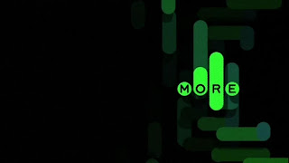
Man vs Machine did a spectacular job working with Jason Bruges Studios on the triangle flip installations. They've thought the idea through thoroughly and progressed to make something stunning to watch.
I do like the slight nod to the original channel 4 logo, and who knows whether this rebrand will stand the test of time, or whether the channel will undergo another facelift in a few years.

New Logo

Old Logo
Thursday, 8 December 2011
Stumbleupon Redesign
I absolutely love stumbleupon. I've spent many hours getting lost in the internet browsing through websites, blogs, portfolios, videos and games. So when I saw the redesign of my procrastination tool by Huge, I was happy to see it looking more sophisticated. The logo feels more considered and designed, that's not saying the previous logo wasn't good, but it felt slightly dated. With stumbleupon becoming more popular by the day, it needs to be at the forefront to fend off any competition that may arise.Saying all that though, I feel that the logo and text are slightly mismatched. The icon is great, and so is the type, but when put together they typeface doesn't seem as smooth as the logo.
 Old Logo

New Logo


New Logo
Tuesday, 29 November 2011
Simplifying Logos
Simplifying logos can make them immediately more impressive. I often found when struggling with logo design, to strip it back to the bare minimum and see if the extra bits were really needed. As a brand and the logo becomes more well known, removing the name or any text can be beneficial in giving the look of the company a bit of a facelift.
More recently the Starbucks logo was stripped back, but so have these other examples (image taken from logo design love)

More recently the Starbucks logo was stripped back, but so have these other examples (image taken from logo design love)

Wednesday, 2 November 2011
La Presse new logo
La Presse is a french newspaper based in Montreal and have recently updated their logo.
The new square logo has replaced the previous rounder version, and I've noticed a trend recently in angular shapes in logo design. Squares work really well as they give a frame for other items to be placed around them, both in print and digitally.

With newspapers generally declining as people read the news online, it's important to have a non-cluttered web page where people can find the article they are interested in quickly and without hassle. Some of the websites I find most annoying are the ones which have too much useless tat taking up valuable space! A good grid is essential in all cases.
 Image taken from newseum.org
The new square logo has replaced the previous rounder version, and I've noticed a trend recently in angular shapes in logo design. Squares work really well as they give a frame for other items to be placed around them, both in print and digitally.

With newspapers generally declining as people read the news online, it's important to have a non-cluttered web page where people can find the article they are interested in quickly and without hassle. Some of the websites I find most annoying are the ones which have too much useless tat taking up valuable space! A good grid is essential in all cases.

Tuesday, 1 November 2011
Branding Article
I've been reading articles refreshing my graphic design brain and came across this interesting one from Fatima Mekkaoui at sixrevisions.com. It's good to read something that is well written and doesn't bulk up the article with useless babble.
Subscribe to:
Posts (Atom)