I found this work a year or so ago, and recently came across it again, and still really like it. It is created by Vapour, a design agency in Leeds. The retro feel, colours, shapes and patterns work well with the brand Nike have established for themselves. The photographs appeal to the active type of person that they are wanting to connect with, and are very far removed from the typical outdoor clothing and accessories that can be plain in colour and not very attractive.
I know it's taken me a while to post this, as the work was produced in 2009, but I like it and think it deserves to be shared.
Thursday, 29 November 2012
Wednesday, 31 October 2012
Halloween Pumpkin Carving
I don't get into the Halloween spirit. It's really not my thing unfortunately, but I do appreciate a good pumpkin carving! These are pretty amazing!!
These amazingly detailed pumpkins were carved by Ray Villafane. He uses clay modelling tools instead of just a knife, and because of that he manages to achieve textures and lines that really stand out from the traditional pumpkin.
Below are some more great examples of other peoples pumpkins.
These amazingly detailed pumpkins were carved by Ray Villafane. He uses clay modelling tools instead of just a knife, and because of that he manages to achieve textures and lines that really stand out from the traditional pumpkin.
Below are some more great examples of other peoples pumpkins.
Wednesday, 24 October 2012
Tetley Team Tea Poster
The lovely people at Tetley Tea Folk found my motivational team tea poster on my website, and they liked it so much they shared it on their Facebook page! The poster has also been tweeted by Strudel, a design company based in London. I had fun making the poster and I'm glad other people are enjoying it also.
It can be viewed by clicking here.
Labels:
Design,
Graphic Design,
Internet,
Poster
Sunday, 21 October 2012
Scott Duncan-Brown - Illustrator
This is my friend Scott Duncan-Brown's work. He is an amazing illustrator, currently working as a story board artist at Kuro Dragon in Gateshead. He is also working with an author to illustrate a childrens book titled The Bare Bear.
His website is having a bit of a revamp at the moment and can be found at www.scottduncanbrown.com, but take a look and check out his work!
Wednesday, 17 October 2012
Ribena Light Packaging Redesign - Aesop
New Ribena Light packaging by Aesop in London. Much simpler, cleaner and feels more refreshed. Removing some of the imagery makes it fit with the idea that there's less sugar. A sort of scaled back version of the 'full-fat' original version. Ribena have recently made a big effort to show that they use blackcurrants grown in Britain so to have a redesigned packaging will refresh the image and keep people talking about the brand.
I still have the idea that if a product has to have a 'light' or 'diet' version, then the original must not be too healthy for you!
Thursday, 4 October 2012
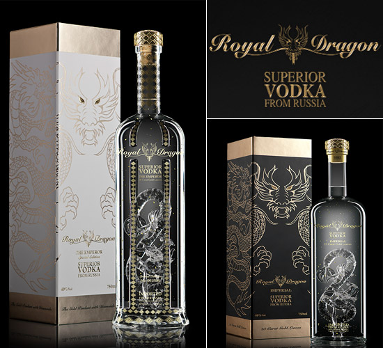
National Vodka Day
Happy National Vodka Day! To celebrate, I've been having a look at some beautifully designed vodka bottles.
Tuesday, 2 October 2012
eBay Logo Redesign
eBay have announced they have redesigned their logo after seventeen years. I haven't been a massive fan of the original logo. It's seemed rather childish and hastily put together, but over time it's grown on me and the colours and style is now totally associated with eBay.
The new logo has lost the playfulness. It's like the brand is trying to grow up, but whilst doing so it is taking away the community feeling that the previous logo had. I'm not a massive fan of the lack of kerning. The letters should either be how they were previously, or not connecting at all. I do prefer the colours, particularly the blue as it seems to flow more, and my eye doesn't get stuck on the letter b.
It's always going to be a tough job to redesign such a memorable logo, and everyone has their own opinions. This design could have been better, but could have been a lot worse.
The new logo has lost the playfulness. It's like the brand is trying to grow up, but whilst doing so it is taking away the community feeling that the previous logo had. I'm not a massive fan of the lack of kerning. The letters should either be how they were previously, or not connecting at all. I do prefer the colours, particularly the blue as it seems to flow more, and my eye doesn't get stuck on the letter b.
It's always going to be a tough job to redesign such a memorable logo, and everyone has their own opinions. This design could have been better, but could have been a lot worse.
Labels:
Branding,
Design,
Graphic Design,
Logo,
Rebranding,
Redesign,
Retail,
Type,
Typography,
Website
Subscribe to:
Posts (Atom)