I never realised a calendar is reusable every 28 years! I found this out from environmentteam.com. It's a great idea to reuse and recycle them, although I can't think of anyone who would keep an unused or old calendar for that long. I imagine there to be a few random shops all over the country who have old calendars for sale but I haven't found one yet. Shabby chic, old boutique, 50's, 60's, doilies and teacups and saucers are all more fashionable at the moment, so some people might like to have a slightly tatty looking calendar on their wall!
Saturday, 26 May 2012
Tuesday, 15 May 2012
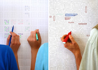
Puzzle Wallpaper
I love the idea of this wallpaper created by CinqCinq - puzzles and games which can be filled in by both kids and adults. The games include word-searches, naughts and crosses and a maze. I like how that the wallpaper would be a focus point of a room, would be a talking point and could also persuade some interaction. There's something about it which brings back thoughts of when I was younger and loved puzzle books and a pack of crayons - but from the photos is feels to me that this idea doesn't work - it looks like kids have used markers to draw over the walls.
Sunday, 13 May 2012
Dispatchwork - Jan Vormann Lego Installation
This urban art installation titles 'Dispatchwork' was an idea by Jan Vormann and others who gave a helping hand. Lego pieces are contructed to fill in gaps in buildings and walls. The colours create an eye catching patchwork in the usually dull wall. The corners are executed particularly well and must have taken a while to perfect.
Saturday, 12 May 2012
Axis Maps - Typographic Maps
These typographic maps by Axis Maps are brilliant. Often typographic maps created and be too cluttered or don't read well, but these have a very suitable typeface which is legible at small point size. The different colours build up an visually pleasing poster that looks like it has depth. I think these maps work much better showing cities which are built on a grid system. London or even Leeds would possibly create quite a mess which wouldn't be as pleasing to look at.
I particularly like the Chicago version in colour. The creators say...
All photos from Axis Maps.
I particularly like the Chicago version in colour. The creators say...
"Typographic Maps accurately depict the streets and highways, parks, neighborhoods, coastlines, and physical features of the city using nothing but type. By weaving together thousands of words, a full picture of the city emerges. Every letter was carefully placed, taking hundreds of hours to complete for each map."The posters and letterpress prints are available to buy for $20-150. Cities available are Manhattan, Chicago, Madison, San Francisco, Washington DC, Boston and New York City.
All photos from Axis Maps.
Labels:
Graphic Design,
Poster,
Retail,
Type,
Typography
Friday, 11 May 2012
I Wish This Was - Ctiy Project
In November 2010, 'I Wish It Was' began in New Orleans. The idea created by Candy Chang was for people to stick specifically created stickers onto empty store fronts and write what they would want to be there. It's a very interesting way for people to get their opinions across, and for the people in charge to make decisions based on what the public need. The stickers look similar to the famous 'My Name Is..' stickers, but instead say 'I Wish This Was..'
The responses ranged from answers such as 'a bakery' to more personal 'the place we kissed for the first time' and also funnier 'less expensive'.
The responses ranged from answers such as 'a bakery' to more personal 'the place we kissed for the first time' and also funnier 'less expensive'.
Monday, 7 May 2012
Lorenzo Duran - Leaf Art for Plant for the Planet
From looking into more of Spanish artist Lorenzo Duran's work, I've found some leaves he was commissioned to create for a German organisation - Plant for the Planet. These are more colourful and based on the theme of pollution and the global problems due that emissions cause. I particularly like the shapes in the plane.
Friday, 4 May 2012
Lorenzo Duran - Leaf Art
Amazing intricate leaf art by Lorenzo Duran. The Spanish artist washes and dries the leaf before cutting away to create a scene or pattern.
Subscribe to:
Comments (Atom)


