Showing posts with label Retail. Show all posts

Thursday, 29 November 2012

Vapour - Nike ACG 20th Anniversary Brochure

I found this work a year or so ago, and recently came across it again, and still really like it. It is created by Vapour, a design agency in Leeds. The retro feel, colours, shapes and patterns work well with the brand Nike have established for themselves. The photographs appeal to the active type of person that they are wanting to connect with, and are very far removed from the typical outdoor clothing and accessories that can be plain in colour and not very attractive.


I know it's taken me a while to post this, as the work was produced in 2009, but I like it and think it deserves to be shared.

Thursday, 4 October 2012

National Vodka Day

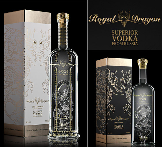
Happy National Vodka Day! To celebrate, I've been having a look at some beautifully designed vodka bottles.


Tuesday, 2 October 2012

eBay Logo Redesign

eBay have announced they have redesigned their logo after seventeen years. I haven't been a massive fan of the original logo. It's seemed rather childish and hastily put together, but over time it's grown on me and the colours and style is now totally associated with eBay.


The new logo has lost the playfulness. It's like the brand is trying to grow up, but whilst doing so it is taking away the community feeling that the previous logo had. I'm not a massive fan of the lack of kerning. The letters should either be how they were previously, or not connecting at all. I do prefer the colours, particularly the blue as it seems to flow more, and my eye doesn't get stuck on the letter b.

It's always going to be a tough job to redesign such a memorable logo, and everyone has their own opinions. This design could have been better, but could have been a lot worse.

Saturday, 15 September 2012

Diet Coke and Jean Paul Gaultier

Diet Coke is still viewed as a ladies drink. Coke Zero is more masculine and has been marketed as such. So a connection between fashion and Diet Coke seems like an obvious thing. At the beginning of 2012 Jean Paul Gaulier was selected as the creative director for Diet Coke. Since then various things have been created to promote the two brands. He isn't the first fashion designer to collaborate with Coke. Karl Lagerfeld, Matthew Williamson and Roberto Cavalli have also worked with the brand.


The obvious change is the packaging. It's an easy and very visible way to get consumers to see the connection between the two brands. There have also been adverts which include the small puppets and Gaultier himself. Posters which feature models using photos of Gaultier have also been created.


I think it's great for designers to collaborate and work on different projects. It must be refreshing to be given a different task, and to be able to make your mark on something that you wouldn't usually have the opportunity to.

Wednesday, 29 August 2012

Bic For Her - just what I've always wanted.


It's ideal to know about your target market when creating and selling a product, but sometimes it can go a bit far. Bic is a huge seller of pens all around he world and so must have done a lot of market research, and had some success stories and also failures. Well I can show one failure.

Bic have created a Bic Cristal 'For Her' range. These pastel coloured pens are described as has a 'thin barrel to fit a women's hand', and an 'elegant design - just for her!'. Why do women need a specific pen? Surely as long as the pen works it's ok? I can understand why there are different lengths of pens, different types, ink, biro, pencil etc, but why have these pens been marketed at women? I'm sure there are men out in the world who would like to use a thinner pen. A more successful brand would have seen it being sold as being a slim version, useful for both men and women. I've come to wonder if Bic are running out of ideas for their products.

There have been many hilarious reviews of this product on the Amazon site, both in the UK and USA. Very sarcastic, witty, and tearing apart the product which may be useful but marketed badly.

The reviews on the Amazon.com site can be found here. The Amazon.co.uk site and more reviews can be found here.

Wednesday, 15 August 2012

Australia Cigarette Packaging Law

An Australian court has backed a new law which stops all branding on cigarette packets. Instead the packaging will now be olive green and will feature graphic health warnings and images on smoking related illnesses.

The tobacco companies are huge, and I'm sure they will have tried to fight this new law, but I think that they probably presumed that the law would not be successful. Smoking laws have been getting stricter, with people not being able to smoke in public places in the UK, even at bus stops. I personally agree fully, and think that people who don't smoke should not be subjected to other people's harmful

Regarding the branding of cigarettes, it has been getting more restricted over the last 20 years. Advertising on tv ceased in the mid 1990s, with shops following in 1999. As with alcohol, the cigarettes can't promote that they are good for your health, make you look cool, professional or calm you down. It's all up to the recognisable logos, the colours, shapes and styles. Tobacco companies have argued that it will be easier for fake cigarettes to be sold, as the packaging will be easy to copy. I think this is probably true, but I think that preventing the companies from using bright, attractive packaging will be a step forward in stopping people smoking.

Britain is considering a law on plain packaging also. Australia have paved the way for other countries to follow in their footsteps, to try protect the health of their nation.

I hope that this law stays as it will hopefully save lots of lives, free up hospitals and clinics from people who have smoking related illnesses, and promote healthier living.

Tuesday, 14 August 2012

Royal Mail London Olympics 2012 Team GB Stamps

After the wonderful success of Team GB at the London Olympics this month, I think it's fitting that they are celebrated as much as possible. Stamps have been around for so long, and there have been many different collections and styles over the years. Every Christmas there are different illustrations, and it is also a good showcase for the people who design them.

Each of the gold medalists from the Olympics has been given their own stamp, with a photograph of them as they were competing or on the podium after receiving their medal. The stamps are a long rectangle shape, to give the most space for the image, alongside the Olympics logo, the words 'Gold Medal Winner' and the winners name and the queens head, which is a standard on all stamps.

Marcus James, the head of design and editorial at the Royal mail said ‘Most stamp projects take around two years to come to fruition,’ says James, ‘with a design period of eight-ten months. With these stamps we had about an hour to design them.’ The stamps had to be finished by the following day after the medal had been won, which is why they had to work quickly.

There are 29 Team GB gold medal stamps available until the end of 2012.


Monday, 13 August 2012

Coke Zero and James Bond Skyfall

After the success of Quantum of Solace, Coke Zero are teaming up with James Bond once again for the 2012 film, Skyfall. I thought their 'Unlock the 007 in you' slogan was good, but the Coke Zero Zero 7 idea was brilliant. I love a play on words - it seems simple but it takes a clever brain to implement the idea successfully.
In my opinion, Coke Zero has always been aimed at men. Diet versions of food and drink are certainly marketed towards women, and Coke Zero have made it ok for men to have a lower calorie drink without losing any of their macho image. James Bond is most definitely a macho man, and to associate the two brands works perfectly.
Below are some images of the Quantum of Solace Coke Zero promotion.

I'm looking forward to seeing the new promotional material, and if it beats the past offerings.


Sunday, 12 August 2012

Toscatti Packaging

At first when I saw the images of these containers I thought it was paint, but after reading further I found it was clever packaging for containers by Toscatti. The creatives behind the design are Anagrama in Mexico. The colours are fresh and attractive, the packaging design is clean and tidy, and the sizes and styles of each container is easily seen. The typeface was designed specifically for Toscatti, and is rounded, friendly and importantly, legible.
I like this design, even if it still does look like paint swatches!


Saturday, 12 May 2012

Axis Maps - Typographic Maps

These typographic maps by Axis Maps are brilliant. Often typographic maps created and be too cluttered or don't read well, but these have a very suitable typeface which is legible at small point size. The different colours build up an visually pleasing poster that looks like it has depth. I think these maps work much better showing cities which are built on a grid system. London or even Leeds would possibly create quite a mess which wouldn't be as pleasing to look at.

I particularly like the Chicago version in colour. The creators say...
"Typographic Maps accurately depict the streets and highways, parks, neighborhoods, coastlines, and physical features of the city using nothing but type. By weaving together thousands of words, a full picture of the city emerges. Every letter was carefully placed, taking hundreds of hours to complete for each map."
The posters and letterpress prints are available to buy for $20-150. Cities available are Manhattan, Chicago, Madison, San Francisco, Washington DC, Boston and New York City.


 All photos from Axis Maps.

Wednesday, 4 April 2012

EDF Dancing Advert - My Keepon

Now I'm not the biggest fan of EDF. Had some big issues with them in the past, and so have many other people. Energy companies aren't seen in the best light by their customers, and this new EDF advert is trying to change that.


A small orange flame looking character dances to music whilst standing on difference appliances. The first time I saw this advert I really liked it - I think it's the way it moves and dances - but I had no idea it was for EDF until the very end. A clever advert to keep viewers watching until their newest promotional information is fed into their ears. However much I like this advert, it won't make me change my opinion of them. It does however make me think that they at least have a good team working on their adverts.

From doing a little research around the internet I've found the little orange dancers really do exist! It is a character created by BeatBots called My Keepon. They say "My Keepon™ is an interactive robotic toy for kids of all ages. In its touch mode, it responds to pokes, pats, and tickles with a rich variety of emotional movements and sounds. In its dance mode, it hears the beat in music or clapping and dances in synchronized rhythm." I think it's not just for kids though! They're available to purchase now from shops such as Toys R Us amongst others.

Any just for good measure, here's almost 4 minutes of pure dancing!


Monday, 19 March 2012

Made in Britain Logo

Ed Miliband recently called for a 'Made in Britain' mark to be put on things made in Britain. There is also a programme shown on Channel 4 titled 'Mary's Bottom Line' where "retail guru Mary Portas believes a a window of opportunity has opened to restore some life back to British manufacturing."

I think it is important to know where products are coming from. Yes, it is nice for things to be cheaper, but I wouldn't mind paying a bit more if it meant a British company was saved from making redundancies or going out of business.


Fresh food has clear labels of the country of origin, and over the last few years there has been a big upturn in the amount of local produce in supermarkets. Morrisons published an article in 2009 stating that they are selling regionally sourced milk so that it tastes fresh and hasn't travelled far to get there.


There is the Red Tractor logo on British meat which is a recognised symbol for high standards and good welfare of the animals. The logo is seen clearly on the front of the meat packaging so it promotes buying British.
Farmers markets are extremely popular, many of them fortnightly and selling more than fruit and veg, but cakes, biscuits and even handmade jewellery and gifts.

Supporting local isn't that hard to do, just take a moment longer to look at the label.

Sunday, 4 March 2012

Coley Porter Bell - M Savers

Another great redesign by Coley Porter Bell. Again, like one of my previous posts, it is regarding Morrisons own brand food range. The own brand range have progressed to have different varieties, from the cheapest-of-the-cheap, to the cheap, to luxury.

 
New Design


 Old Design


This time I'm talking about the cheapest-of-the-cheap range. Each of the major supermarkets have one of these types of own brand. Typically the packaging is quite hideous. Nothing exciting, doesn't particularly stand out on the shelf, and it's not what people like to be seen buying. Coley Porter Bell have rejuvenated the brand for Morrisons. They've made it much more appealing, with each item having some individuality and not being cluttered. Craig Barnes is a senior designer at Coley Porter Bell, and is the creator of the handwritten typeface used. Having a unique typeface shows that the cheapest range has been given some attention, and reflects that the quality of the product may be higher. It has also been renamed from 'Morrisons Value' to 'M Savers'. Even the name is more appealing.

I've seen some of the new packaging in store, and there's still more to come.

Thursday, 1 March 2012

Adobe Creative Suite Pillows

I'm loving these Creative Suite pillows. Perfect for someone who wants to surround themselves with design all day! They're available for each CS program and look really soft and comfy. The creators mysuitestuff say that each pillow is hand-cut, sewn, stuffed, then stitched closed. Available in 12"x12" or the mini versions are 4"x4" from mysuitestuff.


Monday, 12 December 2011

Grafik Magazine Discontinued. The Future of Magazines?

I've recently heard about the magazine Grafik being discontinued. Just over a ago I had a subscription to the mag and did enjoy reading through the articles and reviews. It brings into mind the question of how important magazines are these days, especially when the internet is so readily available with it's mountain of up to date information. I like to have my magazines as reference material, but they take up so much room and sometimes finding an article or designer can take ages as I have to search through each journal. Using bookmarks on internet browsers are much easier, and you can search for words or phrases in text. Computers can break though, and what if all those bookmarks are lost? It would be as though someone has stolen your library, and I'm not sure if there's many of those crimes in the UK.

There's just something nice about having an item to own and keep. The internet is great, and I'm not giving up on magazines and books.

Friday, 25 November 2011

AT&T Hand Art Adverts

Just amazing! Adverts that give make you double take, and then look a while longer are really well worked and successful.


Wednesday, 20 January 2010

Macbook Cover

An interesting macbook cover. A little pricey, but a good way to hide your mac away!

Macbook BookBook