Showing posts with label Packaging. Show all posts

Wednesday, 17 October 2012

Ribena Light Packaging Redesign - Aesop

New Ribena Light packaging by Aesop in London. Much simpler, cleaner and feels more refreshed. Removing some of the imagery makes it fit with the idea that there's less sugar. A sort of scaled back version of the 'full-fat' original version. Ribena have recently made a big effort to show that they use blackcurrants grown in Britain so to have a redesigned packaging will refresh the image and keep people talking about the brand.


I still have the idea that if a product has to have a 'light' or 'diet' version, then the original must not be too healthy for you!

Thursday, 4 October 2012

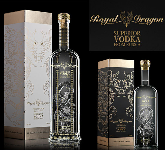
National Vodka Day

Happy National Vodka Day! To celebrate, I've been having a look at some beautifully designed vodka bottles.


Saturday, 15 September 2012

Diet Coke and Jean Paul Gaultier

Diet Coke is still viewed as a ladies drink. Coke Zero is more masculine and has been marketed as such. So a connection between fashion and Diet Coke seems like an obvious thing. At the beginning of 2012 Jean Paul Gaulier was selected as the creative director for Diet Coke. Since then various things have been created to promote the two brands. He isn't the first fashion designer to collaborate with Coke. Karl Lagerfeld, Matthew Williamson and Roberto Cavalli have also worked with the brand.


The obvious change is the packaging. It's an easy and very visible way to get consumers to see the connection between the two brands. There have also been adverts which include the small puppets and Gaultier himself. Posters which feature models using photos of Gaultier have also been created.


I think it's great for designers to collaborate and work on different projects. It must be refreshing to be given a different task, and to be able to make your mark on something that you wouldn't usually have the opportunity to.

Wednesday, 29 August 2012

Bic For Her - just what I've always wanted.


It's ideal to know about your target market when creating and selling a product, but sometimes it can go a bit far. Bic is a huge seller of pens all around he world and so must have done a lot of market research, and had some success stories and also failures. Well I can show one failure.

Bic have created a Bic Cristal 'For Her' range. These pastel coloured pens are described as has a 'thin barrel to fit a women's hand', and an 'elegant design - just for her!'. Why do women need a specific pen? Surely as long as the pen works it's ok? I can understand why there are different lengths of pens, different types, ink, biro, pencil etc, but why have these pens been marketed at women? I'm sure there are men out in the world who would like to use a thinner pen. A more successful brand would have seen it being sold as being a slim version, useful for both men and women. I've come to wonder if Bic are running out of ideas for their products.

There have been many hilarious reviews of this product on the Amazon site, both in the UK and USA. Very sarcastic, witty, and tearing apart the product which may be useful but marketed badly.

The reviews on the Amazon.com site can be found here. The Amazon.co.uk site and more reviews can be found here.

Wednesday, 15 August 2012

Australia Cigarette Packaging Law

An Australian court has backed a new law which stops all branding on cigarette packets. Instead the packaging will now be olive green and will feature graphic health warnings and images on smoking related illnesses.

The tobacco companies are huge, and I'm sure they will have tried to fight this new law, but I think that they probably presumed that the law would not be successful. Smoking laws have been getting stricter, with people not being able to smoke in public places in the UK, even at bus stops. I personally agree fully, and think that people who don't smoke should not be subjected to other people's harmful

Regarding the branding of cigarettes, it has been getting more restricted over the last 20 years. Advertising on tv ceased in the mid 1990s, with shops following in 1999. As with alcohol, the cigarettes can't promote that they are good for your health, make you look cool, professional or calm you down. It's all up to the recognisable logos, the colours, shapes and styles. Tobacco companies have argued that it will be easier for fake cigarettes to be sold, as the packaging will be easy to copy. I think this is probably true, but I think that preventing the companies from using bright, attractive packaging will be a step forward in stopping people smoking.

Britain is considering a law on plain packaging also. Australia have paved the way for other countries to follow in their footsteps, to try protect the health of their nation.

I hope that this law stays as it will hopefully save lots of lives, free up hospitals and clinics from people who have smoking related illnesses, and promote healthier living.

Sunday, 12 August 2012

Toscatti Packaging

At first when I saw the images of these containers I thought it was paint, but after reading further I found it was clever packaging for containers by Toscatti. The creatives behind the design are Anagrama in Mexico. The colours are fresh and attractive, the packaging design is clean and tidy, and the sizes and styles of each container is easily seen. The typeface was designed specifically for Toscatti, and is rounded, friendly and importantly, legible.
I like this design, even if it still does look like paint swatches!


Monday, 19 March 2012

Made in Britain Logo

Ed Miliband recently called for a 'Made in Britain' mark to be put on things made in Britain. There is also a programme shown on Channel 4 titled 'Mary's Bottom Line' where "retail guru Mary Portas believes a a window of opportunity has opened to restore some life back to British manufacturing."

I think it is important to know where products are coming from. Yes, it is nice for things to be cheaper, but I wouldn't mind paying a bit more if it meant a British company was saved from making redundancies or going out of business.


Fresh food has clear labels of the country of origin, and over the last few years there has been a big upturn in the amount of local produce in supermarkets. Morrisons published an article in 2009 stating that they are selling regionally sourced milk so that it tastes fresh and hasn't travelled far to get there.


There is the Red Tractor logo on British meat which is a recognised symbol for high standards and good welfare of the animals. The logo is seen clearly on the front of the meat packaging so it promotes buying British.
Farmers markets are extremely popular, many of them fortnightly and selling more than fruit and veg, but cakes, biscuits and even handmade jewellery and gifts.

Supporting local isn't that hard to do, just take a moment longer to look at the label.

Sunday, 4 March 2012

Coley Porter Bell - M Savers

Another great redesign by Coley Porter Bell. Again, like one of my previous posts, it is regarding Morrisons own brand food range. The own brand range have progressed to have different varieties, from the cheapest-of-the-cheap, to the cheap, to luxury.

 
New Design


 Old Design


This time I'm talking about the cheapest-of-the-cheap range. Each of the major supermarkets have one of these types of own brand. Typically the packaging is quite hideous. Nothing exciting, doesn't particularly stand out on the shelf, and it's not what people like to be seen buying. Coley Porter Bell have rejuvenated the brand for Morrisons. They've made it much more appealing, with each item having some individuality and not being cluttered. Craig Barnes is a senior designer at Coley Porter Bell, and is the creator of the handwritten typeface used. Having a unique typeface shows that the cheapest range has been given some attention, and reflects that the quality of the product may be higher. It has also been renamed from 'Morrisons Value' to 'M Savers'. Even the name is more appealing.

I've seen some of the new packaging in store, and there's still more to come.

Saturday, 17 December 2011

Jack Daniels Packaging


Every so often I get items through the post from Jack Daniels. Most recently was a set of coasters. I like the typography they use on the packaging. The simple black, white and orange are very effective (the orange being a similar colour to the whiskey itself). By sending out small items at no cost to the recipient, they are strengthening the brand by giving a feeling that Jack Daniels cares about its customers and likes to reward them for their loyalty.

Wednesday, 16 November 2011

Barcode Design

As a designer it's important to think about the whole experience for whoever's viewing, buying, selling or doing whatever with a designed item. Barcodes are generally a necessity for packaging, however they don't have to look so square and boring. They can be made so much more interesting by just giving them a little thought. Even though the style of barcode won't sell the product, as a consumer, I would feel more confident in buying it if I could see that it had time spent on it to make it appeal to me, and the company felt it was worth going that little bit further in the design.


Friday, 21 October 2011

Morrisons Own-Brand Range

Morrisons recently redesigned their own-brand range of products. The company chosen to undertake the project was Coley Porter Bell, who also designed the Tesco Organic range.


With more people unable to afford dining out, it is important to make the dine-in ready meal/cook at home ranges to seem like something special and a treat. The bistro range does that, with black packaging and warm foody coloured accents.

According to Design Week, the Morrisons Value range will be next to have a facelift. I'm expecting great things!

Friday, 1 April 2011

Kohler Chocolate Packaging


Kohler chocolate packaging is very elegant and well designed. There is a classic feel, however still feels somewhat contemporary. The buyer is getting chocolate that is desirable, not only through taste but aesthetically also.